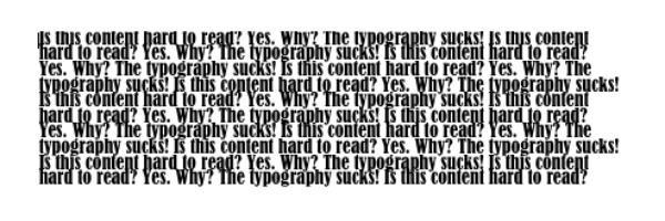
“Something looks funny with the web copy…it looks really bad.” That was a part of the message we recently received form a client who was reviewing a design mock-up for his soon-to-be-launched website. “We really like the copy,” they had said just a few days earlier. So they liked what it stated, just not how it looked. The culprit: typography.
Continue reading →

Hysteria continues to grow since a news source reported Americans are collectively becoming paralyzed due to documents comprising “solid blocks of uninterrupted text.”
Continue reading →
Posted on Jan 25 2011 4:46 pm by Web Copywriters
tags: Web Content Studies Writing for the Web
|
category: Writing for the Web |
Leave a comment

The Apple logo on a laptop or phone may evoke the same feelings for some people as a crucifix or Star of David pendant does for others, suggests research by Tel Aviv University, Duke University and New York University scientists. According to their research, brands are a form of self-expression and a token of self-worth, just like symbolic expressions of one’s faith.
Continue reading →

Do you spend more time than you need to on Facebook, Twitter, Google and any other of the two billion websites floating around the Internet? You may be suffering from a condition scientists are calling Information Deprivation Disorder.
Continue reading →

Recently, 52 Weeks of UX posted an article that challenged a commonly held opinion regarding web content — that it should be as concise and simple as possible in order to appeal to the average web user, whose attention span online doesn’t often creep past a few seconds. The popular theory goes, that if you don’t deliver the pertinent facts quickly, your website visitors will get frustrated and go elsewhere to find the information they desire.
In response to the point that web copy should be brief, the article’s author, Joshua Porter, stated: “There are several problems with this assumption, however. First, people do actually read on the Web…scanning is simply the first step in the process. Second, short text can be just as poorly written as long text (and often is). Third, people actually seek out and enjoy reading longer texts.“
Here are the author’s points supporting this statement, and our take:
Continue reading →

Online visitors form a first impression of a website quicker than the blink of an eye — literally. It typically takes humans 300 to 400 milliseconds to blink. Meanwhile, scientific research led by Dr. Gitte Lindgaard at Carleton University in Ontario reveals websites have as little as 50 milliseconds to establish a first impression — a mere 1/20th of a second. That’s it!
This is crucial information for any business because once a visitor forms an impression on a subconscious level, he or she will selectively search for information confirming that impression. People do this because we all want to prove we have good judgement. So, if our first impression of a website is negative, we have a tendency to mainly seek and see the negatives, regardless how good a business’ products and services might actually be. Alternatively, if we immediately like what we see, we’ll look for positive information to reinforce that impression.
So how do you avoid making a bad first impression on the Web? Easy. Get a good designer.
Continue reading →

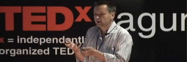
Award-winning designer Gonzalo Alatorre, speaking at a TED conference in Mexico last month, suggested design needs to be like a quesadilla. Where was the Founder and Principal of Creative Engine, and designer of the 2010 Vancouver Winter Olympics logo going with this? We spoke to the Alatorre to uncover his motivation for making such a seemingly bizarre claim.
Continue reading →

Website visitors are demanding fast-loading sites, just like they did in the 90s. But are they getting it? Despite faster Internet connections, users complain websites are still too slow, suggest tests conducted by usability specialist Jakob Nielsen.
Continue reading →
Websites should be focused on customers’ multichannel experiences, reported Forrester Research. Why, then, is email customer service trapped in a silo?
“Email customer service habitually drives customers further — sometime irreparably — from their online objectives,” stated Forrester’s Diane Clarkson.
In a recent Forrester evaluation of retail websites, websites commonly missed opportunities to use email customer service to encourage web interactions or provide seamless transitions to other channels.
“eBusiness professionals must re-address how their customer service email strategies can keep consumers satisfied,” noted Clarkson, “by re-engaging them with online content, facilitating online purchases, and providing seamless cross-channel customer service.”
Posted on Dec 1 2009 12:41 am by Web Copywriters
tags: Web Content Studies
|
category: Website promotions Writing for the Web |
Leave a comment
Service seekers are excellent customers to target, reports Forrester’s Bruce Temkin.
In previous research, Forrester created four segments of consumers based on their interest in low prices and good customer service: service seekers, price seekers, price & service seekers, and others. The research firm examined the loyalty of these segments across 12 industries.
“Across all industries, service seekers were more likely than price seekers to buy more products, stay with their current provider, and recommend their provider to friends and colleagues,” noted Temkin.
It validates our belief that merely positioning your product on the lowest price is a slippery route. There’s always a business that will come in and undercut you, and swiftly steal your marketshare.
Alternatively, the more reasons you give people to choose your brand, price becomes a less important purchase decision factor. As a result, you’ll attract people that value quality, are willing to pay for it, and will stick around for the long haul.
Posted on Sep 11 2009 2:02 pm by Web Copywriters
tags: Marketing Web Content Studies
|
category: Business & marketing |
Leave a comment
