 Most business owners don’t ask for a weak website. They ask for something nice.
Nice design. Nice photos. Nice colours. Nice layout. Nice words about quality, service and experience.
And that is usually where the problem starts.
Nice feels safe. Nice gets approved. Nice makes the website look finished. It gives everyone involved the sense that the business has shown up properly online, wearing clean shoes and a decent shirt.
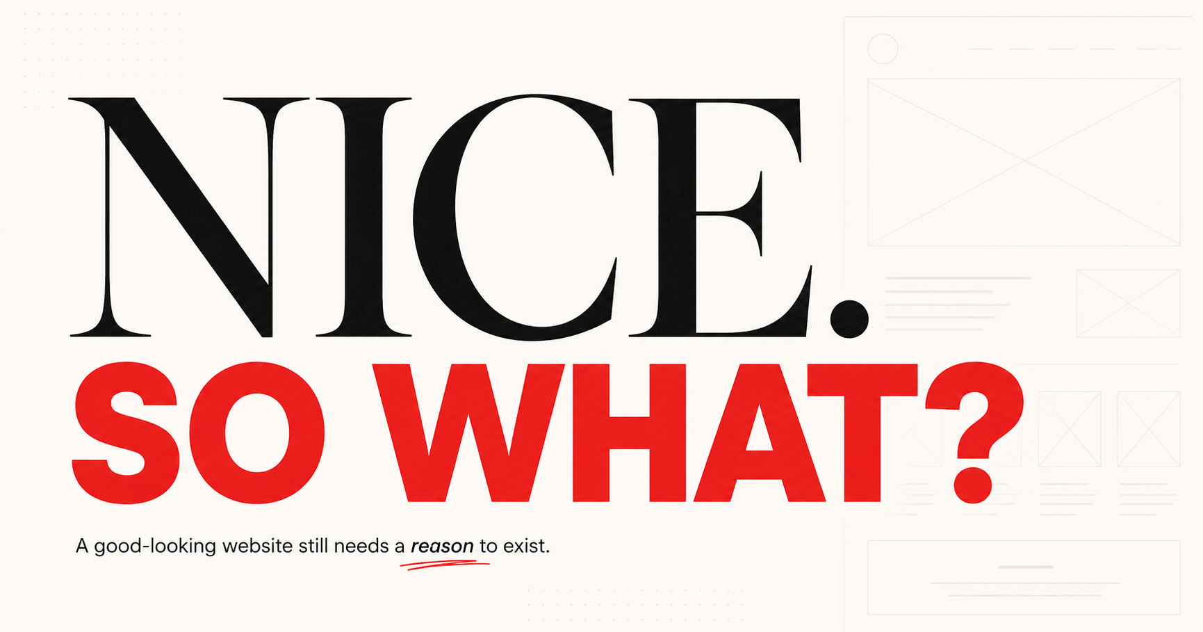
But nice is not a strategy.
A website can look clean, modern and professional and still fail to explain why the business is worth choosing. It can impress the owner, satisfy the committee, please the eye and still leave the visitor with no clear reason to call, book, buy, inquire or remember anything about the company ten minutes later.
That is not usually a design problem.
It is a thinking problem.
Good Design Needs Something to Say
Good designers know this. They are not simply choosing fonts, colours and images. They are shaping attention, creating hierarchy, reducing friction, guiding the visitor and helping a business feel credible before a word is read.
But design works best when there is a clear strategy behind it.
When the business is vague, even good design gets forced into decoration. The designer ends up making uncertainty look better. The writer ends up trying to give shape to ideas that should have been decided earlier. The website gets built, but the hard questions never really get answered.
Who is this for?
What problem does the business solve best?
Why should someone trust this company over the next one?
What proof matters?
What does the visitor need to understand before taking the next step?
What should the website make obvious in the first few seconds?
Those are not little copy questions to sort out at the end. They are the foundation of the project.
Too often, they get skipped.
The site is treated as a visual project first. The business owner wants it to look current. The designer creates something polished. Pages are approved. Space is reserved for content. Then someone says, “We’ll fill that in later.”
That sentence has damaged more websites than bad typography ever could.
Content is not something to pour into empty boxes after the real work is done. It is part of the real work. It helps decide what belongs on the page, what should be removed, what should be emphasized and how the business should be understood.
Without that thinking, a website quickly becomes a collection of nice sections that do not add up to a strong message.
You see it everywhere.
A homepage that opens with a broad promise about helping clients succeed. A service page that lists what the company does but never explains why any of it matters. An about page that says the team is passionate, experienced and committed to excellence. A contact page that asks for action before giving the visitor enough confidence to take it.
None of it is terrible. That is the tricky part.
It is reasonable. Familiar. Acceptable.
It sounds like a website.
But sounding like a website is not the same as communicating.
Looking Decent Is No Longer Enough
The web has raised the visual floor. Templates are better. Platforms are better. Small businesses can now launch sites that look more polished than many expensive sites from ten or fifteen years ago. AI tools have made it even easier to produce pages, headlines, service descriptions and brand language that seem fine at first glance.
That creates a new problem.
If everyone can look decent, looking decent becomes less valuable.
The advantage moves to the businesses that are clearer, sharper and more specific. The ones that know what they want to be known for. The ones that understand their customers well enough to speak plainly. The ones that respect design and content as strategic tools, not finishing touches.
This is where many website projects go soft.
The business owner wants the website to “look professional,” but professional is not enough. A bank lobby looks professional. So does a dentist’s waiting room. So does a software demo that nobody understands.
Professional is a baseline. It is not a reason to choose.
The same goes for modern. Modern is not a message. It is not a position. It does not explain why a customer should trust you with their money, time, project, health, home, brand or business.
Modern can help you look legitimate.
Strategy helps you become meaningful.
That is why the best websites usually come from better conversations at the beginning.
Not just, “What pages do we need?”
But, “What are people unsure about before they contact us?”
Not just, “What should the homepage say?”
But, “What does the right visitor need to believe before moving forward?”
Not just, “Can we make this look more premium?”
But, “What would make this feel more credible, useful and true?”
Those questions change the project. They give the designer better material to work with. They give the writer a sharper direction. They help the business owner stop trying to say everything and start saying the right things.
Because most websites are not weak because they need another paragraph.
They are weak because they are trying to avoid making a decision.
Where Clarity Goes to Die
Businesses often want to serve everyone. They want to mention everything. They want to sound established but friendly, bold but safe, expert but approachable, different but not too different.
So the language becomes soft.
The design has to hold everything together.
And the visitor has to work too hard.
A good website should reduce effort. It should make the business easier to understand and easier to choose. That does not mean the writing has to be clever or loud. In most cases, it needs to be clearer, more useful and more honest.
Say what you do.
Say who it is for.
Say why it matters.
Show proof.
Make the next step obvious.
This sounds simple until a real business tries to do it. Then the politics arrive. The old brochure copy returns from the drawer. Someone wants to keep a sentence because the founder likes it. Someone wants to add another audience. Someone wants the homepage to mention every service. Someone wants to say “solutions” because it feels flexible.
Flexibility is often where clarity goes to die.
A website cannot be strong if every important sentence has been softened to survive approval.
This is why business owners should bring designers and content specialists into the strategy earlier, not later. The best work happens when those experts are allowed to question the brief, not just execute it.
A designer might see that the page is asking visitors to make too many decisions.
A content strategist might see that the offer is buried under generic claims.
A UX specialist might see that the next step is unclear.
A copywriter might see that the proof appears after the point where doubt begins.
These are not cosmetic observations. They affect whether the website works.
And that is the point.
A website is not there to be admired by the people who paid for it. It is there to help the right visitors understand the business, trust it and take action.
That requires more than nice.
Nice is easy to approve because it does not challenge anyone.
Clear is harder.
Specific is harder.
Useful is harder.
Different is harder.
But that is where the value is.
The Cost of Settling for Nice
The businesses that get better results from their websites are usually not the ones that crammed in the most information or chased the latest visual trend. They are the ones that made better decisions before the site was built.
They knew what mattered.
They respected the visitor’s time.
They gave the design something meaningful to express.
They gave the content a real job.
They did not treat the website as online decoration for the business. They treated it as part of the business.
That distinction matters.
A nice website can make a company look alive.
A strategic website can help it grow.
The first one says, “We exist.”
The second one says, “Here’s why you should care.”
That is the gap many businesses are sitting in right now. Their websites look good enough to avoid urgency, but not strong enough to create momentum. They are not broken in an obvious way. They are just quietly underperforming.
And quiet underperformance is easy to ignore.
There is no dramatic warning sign. No flashing red light. No angry visitor sending a note that says, “I left because your message was too generic and your proof did not reduce my hesitation.”
People just leave.
They compare. They skim. They forget. They choose someone else.
That is the cost of settling for nice.
A Website That Knows What It Is Doing
The next generation of better websites will not simply be prettier. They will be more deliberate. They will combine smart design, sharper content and clearer strategy from the start. They will not ask visuals to cover up weak thinking or ask copy to patch holes after the layout is done.
They will be built around decisions.
Who this is for.
What matters most.
What needs to be said first.
What proof belongs where.
What should be removed.
What action should feel natural.
Those decisions are what turn a website from a polished object into a useful business tool.
Good design still matters. Of course it does. Good content matters too. So do structure, usability, proof, speed, photography, tone and trust.
But none of it works as well when the business settles for nice before the strategy is clear.
Nice might get the website approved.
Clear gets it used.
Specific gets it remembered.
Strategic gets it working.
And that is the standard more businesses should be aiming for now.
Not just a website that looks good.
A website that knows what it is doing.


That’s the problem with AI — people can hit pretty images and proper sounding content easily, but they all are starting to sound the same. The good thing is actual unique content stands out big time.
Exactly, Don. AI raises the floor, but it also makes the middle very crowded.
Real thinking stands out more now, not less.
Agree with the premise of the article. It’s also worth noting that studies indicate 69% of users trust AI-generated content less than human-generated content.
Interesting stat, David! I’m not surprised. I wonder if that number will increase over time.
Biz owners keep churning out AI generic material and then are surprised it doesn’t do anything for their leads or sales. When everyone can do the same thing it’s not going to stand out.
Agreed, J! The bar has been raised, but almost everyone’s at the same bar.