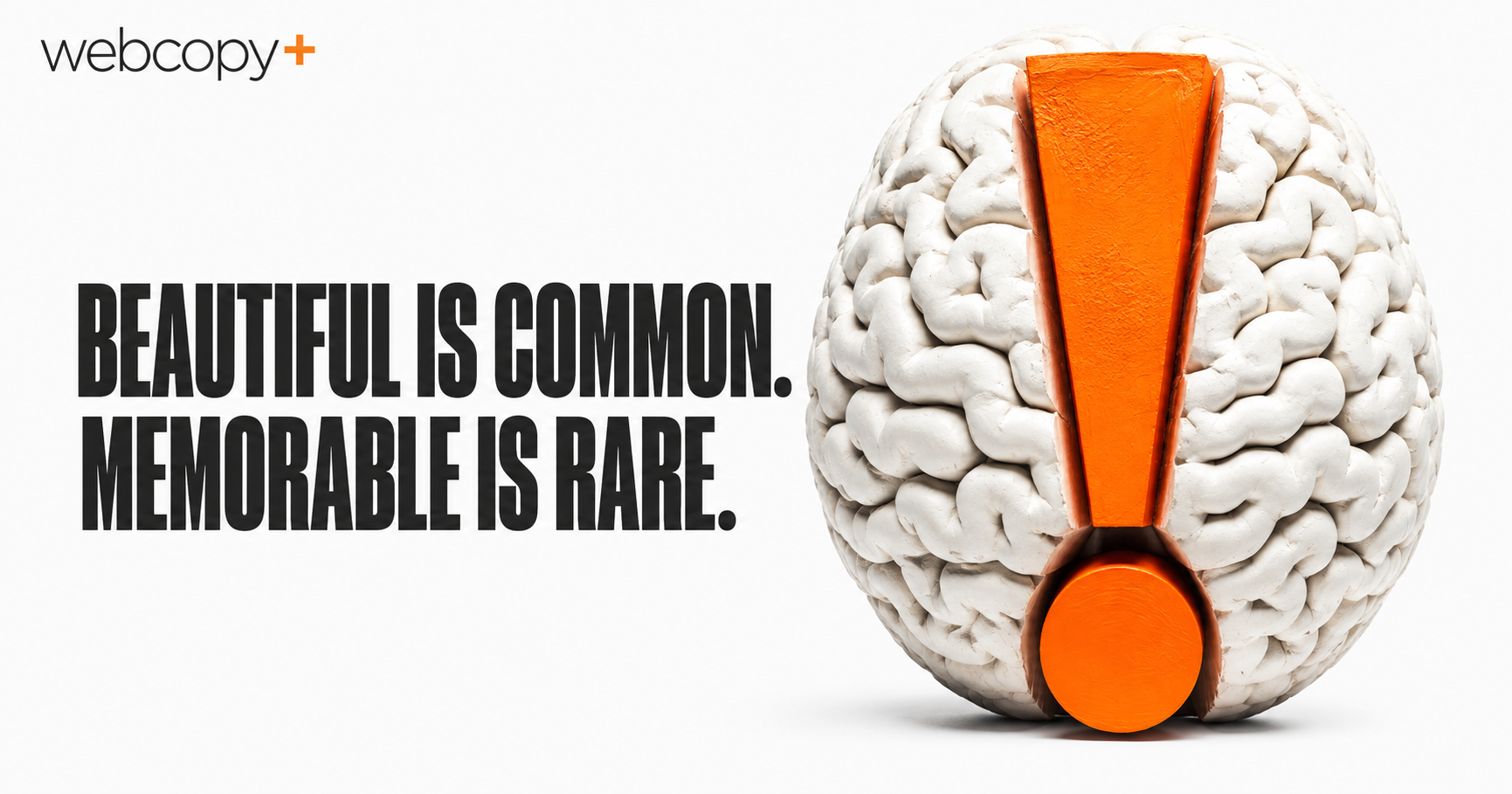
There was a time when simply having a polished website helped a business stand apart.
That time has packed up its gradients and left.
Today, competent design is everywhere. Templates are better. Tools are easier. Stock photography has become suspiciously handsome. Even modest businesses can launch websites with clean typography, generous white space and tasteful animations that arrive as though entering a gallery opening.
That is good news for the Internet.
For businesses trying to stand apart, it creates a new problem.
When every website looks professional, what makes one stick?
GOOD DESIGN EARNS ENTRY, NOT MEMORY
Design still matters enormously.
A recent Clutch survey found that 83% of consumers judge a website’s credibility within 20 seconds, while 84% said design influences whether they will shop with a brand.
Good design remains the price of admission. But admission is not distinction.
A website can look polished, load quickly and behave perfectly while leaving absolutely nothing behind.
The visitor may trust it, even appreciate it, yet five minutes later be unable to identify it in a lineup.
Professional design removes reasons to reject a website.
It does not automatically create a reason to remember one.
DESIGN AND CONTENT MUST CREATE ONE IDEA
I have been making some version of this argument for nearly 20 years.
In 2007, I wrote:
“What you write is what you are, especially on the Web.”
The point was that businesses build their brands through every word they use, not merely through logos, colours and other elements of visual identity.
Language creates personality. It sets expectations. It shapes how people interpret the company behind the screen.
A few years later, I argued that good copywriting is interface design. The content should help determine the structure, hierarchy and experience rather than being poured into a completed layout like batter into a muffin tray.
The argument was never that words matter and design does not. It was that the two should create one idea.
The message should influence the structure. The structure should strengthen the message. The imagery should add meaning rather than merely occupy the rectangular area thoughtfully provided for imagery.
When those elements are developed separately, the website may still look good.
It just tends to look good in the same way as several hundred others.
Memorability begins when a business has something distinctive to say and the entire experience is built to help it say it.
CLARITY BEATS DECORATION
Harley Rivét, president of Deep Dish Digital, believes memorable websites begin by communicating their purpose quickly:
“A website should quickly convey who you are, what you do and why it matters, with as few words as possible. Good design is table stakes. Websites set themselves apart by clearly communicating their purpose in relation to the visitor’s needs.”
That last part is critical.
Many websites explain the business without making the business relevant.
They announce experience, quality, innovation and commitment.
So does nearly everyone else.
The words may be perfectly respectable, but they pass through the brain wearing visitor badges.
Memorability does not come from saying more.
It comes from finding the clearest, most specific version of what matters.
Not:
We provide innovative solutions.
But:
We help manufacturers uncover the production problems costing them thousands every shift.
One occupies space. The other creates a picture.
The first could belong to almost anyone. The second begins to belong to someone.
A HOMEPAGE SHOULD BUILD A BRAND
Creative director and brand designer Dan O’Leary argues that many homepages focus too heavily on what happens to be for sale today:
“The websites I remember are the ones that build brand, not just sell a product. A homepage showing me the latest colourway or fabric might give me a reason to click, but it is not telling me much about the brand.”
Repeat customers may arrive looking for a particular product, promotion or update.
They already possess context.
New visitors do not.
For them, the homepage has a larger job. It must communicate a point of view, personality or proposition that gives the individual products somewhere meaningful to live.
That does not require a lofty manifesto.
Nobody needs 900 words about how a software company was born from an ancient desire to bring humanity together.
It does require an identifiable character.
What does the company notice that competitors overlook?
What does it believe?
What does it do differently enough to be worth choosing?
Can someone feel any of that before reaching the footer?
FACTS EXPLAIN. EMOTION STICKS.
In a 2014 Smashing Magazine article, I argued that as products and services become harder to distinguish through function alone, the emotional experience surrounding a company becomes part of the difference.
That does not mean every website needs a heartbreaking founder story, swelling piano music and a slow-motion video of wheat.
It means visitors should feel something more specific than:
This appears professional.
Confidence.
Relief.
Curiosity.
Belonging.
Excitement.
Amusement.
Facts help people understand a business.
Emotion gives those facts somewhere to land.
CONTRAST CREATES MEMORY
Sometimes memorability comes from an unexpected combination.
Designer Heather Wagner created The Cat Throne, a website for a product that trains cats to use a human toilet.
The raw material could easily have produced a novelty site filled with cartoon paw prints, bathroom jokes and typography that should be taken outside and gently released.
Instead, Wagner presented it as a premium lifestyle brand.
“Elegant typography, generous white space, warm natural tones and sophisticated photography create an upscale experience that contrasts with the unexpected sight of a cat using a toilet.”
That contrast makes people pause and changes the meaning of the product. Something that could feel ridiculous becomes modern, aspirational and surprisingly plausible.
The memorable element is not simply the cat.
It is the distance between what visitors expect and what they receive.
Businesses often try to become memorable by adding more.
Louder headlines. Brighter colours. Larger claims. Animation with the energy of an unattended toddler.
Contrast can be more powerful. Serious and playful. Technical and human. Premium and peculiar.
Familiar enough to understand, unexpected enough to register.
SAFE IS EXPENSIVE TOO
Businesses often treat originality as the risky option.
But there is also risk in looking and sounding like everyone else.
In a 2018 interview on creativity and entrepreneurship, I spoke about enjoying work with clients willing to take small, calculated creative risks. The objective was not to be different for its own sake. It was to demonstrate why the company was the prospect’s best or only choice.
That becomes difficult when every decision is filtered through:
Will anyone object?
The result may be tasteful.
It may be competent.
It may survive all 14 people on the approval committee.
It may also emerge with the personality of an airport carpet.
A memorable website does not need to be strange.
It needs to contain something competitors could not comfortably claim, copy or wear.
A point of view.
A phrase.
A story.
A visual contradiction.
A particular way of explaining the problem.
Without something truly its own, a website may avoid criticism, but it may also avoid memory.
CONTENT MUST TRAVEL WITHOUT THE INTERFACE
Pete Bishop of ZGM raises a larger question: what happens as more people receive information through search summaries, AI tools and apps rather than browsing websites directly?
“If you are lucky enough to have a real human visit your website, it is ultimately the content that should grab them and get them excited because, more and more, it is the content that will get exposure, not your interface.”
The website is not vanishing tomorrow.
But its content is increasingly encountered outside the original design.
Pew Research Center found that Google users clicked a traditional search result in 8% of visits when an AI summary appeared, compared with 15% when one did not. Links within the summaries themselves received clicks in only 1% of visits.
A potential customer may first encounter your business through a search excerpt, AI summary, quoted paragraph, product feed or generated recommendation.
The interface may not travel with the content.
The idea must.
That makes distinctive language, clear positioning and a strong content strategy more important, not less
A generic message becomes even more generic when stripped from its design.
A strong idea can survive the journey.
MEMORABLE DOES NOT MEAN FLASHY
The most memorable business websites rarely depend on one spectacular trick.
They create a coherent impression.
The design, language, imagery, offer and personality all appear to belong to the same company.
That sounds obvious until you examine the average website.
The homepage sounds bold.
The service pages sound institutional.
The About page sounds as though it was written during a hostage negotiation.
Then the calls to action become extremely excited and invite you to UNLOCK YOUR POTENTIAL TODAY.
Nothing is necessarily terrible.
Nothing feels whole.
Memorability comes from accumulated specificity:
A clear position.
A recognizable voice.
Ideas worth repeating.
Details competitors could not claim.
A visual world that reinforces the message rather than decorating around it.
The strongest websites do not merely contain good parts. The parts recognize each other.
THE REAL TEST
After visiting your website, people may not remember every service, credential or feature.
They should remember something.
Who the business is for.
What it sees differently.
How it made them feel.
Why it might be the right choice.
Ask someone to look at your homepage for 20 seconds, then close it.
Do not ask whether they liked it.
Ask what they remember.
That is the harsher question. It is also the useful one.
A visitor may forget your colour palette, animations and carefully considered button radius.
They should not forget what made your business worth choosing.


The standard for common has been raised. Professional designers and other creatives bring businesses to the next level, so they provide good value like they did before.