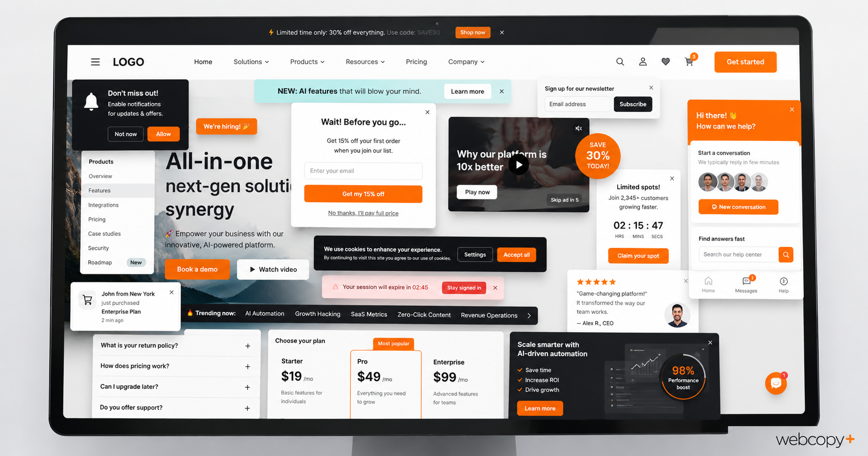
Websites should grow.
A business adds services, enters new markets, develops useful resources and learns more about what its customers need. Done strategically, that growth can create opportunities, improve search visibility and give visitors clearer paths to conversion.
The trouble starts when the growth is random.
A new page gets bolted on. Then a pop-up. Then a chatbot. Then another call to action, a video background, three new plug-ins and a carousel nobody has willingly swiped since 2014.
Nothing gets removed because everything once seemed important to someone.
One is strategic growth.
The other is a dusty junk drawer with navigation.
According to the 2026 WebAIM Million report, the average homepage now contains 1,437 elements, a staggering 22.5% increase in one year. The study also detected an average of 56.1 accessibility errors per homepage. These are barriers likely to represent failures under WCAG, the Web Content Accessibility Guidelines.
Automated testing cannot identify every accessibility problem, and complexity alone does not make a website inaccessible or ineffective. But the broader trend is difficult to ignore.
Websites are becoming bigger, busier and more complicated.
The best website upgrade, then, may not be adding something.
It may be deciding what no longer deserves to be there.
SUBTRACTION IS NOT THE SAME AS EMPTINESS
This is not an argument for turning every website into a white screen with a logo, three mysterious words and a button that says ENTER.
A business website still has work to do. It needs to explain, persuade, reassure, differentiate and move people toward a decision.
Subtraction is not minimalism for its own sake.
It is hierarchy.
It means giving the important things more room by removing, reorganizing or reducing everything competing with them.
Sometimes that means deleting a feature. Sometimes it means presenting less information at once. Sometimes it means cutting 100 words before they smother the seven that actually matter.
Three experienced website professionals offered three useful places to begin.
REMOVE THE ENDLESS WALL OF CONTENT
Juliette Schmerler, Founder and Account & Project Management Lead at Spark Tank Franchise Marketing, believes many business websites would be better without long, uninterrupted stretches of content.
Her point is not that businesses should throw useful information overboard. It is that visitors should not have to scroll through every available detail to find the one section that matters to them.
That is especially relevant on mobile. According to Statcounter Global Stats, mobile devices accounted for approximately 52.2% of worldwide web traffic in June 2026.
Juliette sees the challenge most clearly on one-page websites and landing pages, where businesses may need to communicate plenty of information without creating a thumb-powered endurance event.
Her preferred solution is better organization:
One of the best ways to organize content is by using tabs, accordions, or sub-navigation menus. These elements allow visitors to choose the information they’re most interested in, rather than forcing them to scroll through large blocks of content.
On the A&W franchise website, for example, her team organized a substantial section into tabs covering training, marketing, operations, restaurant development and financing.
Visitors can jump directly to the subject that interests them rather than trudging past everything that does not. 
Spark Tank took a similar approach on the Starz Programs website. The previous site listed each program and its lengthy description in one continuous stretch. The redesigned page uses sub-navigation to keep everything accessible without displaying it all at once.
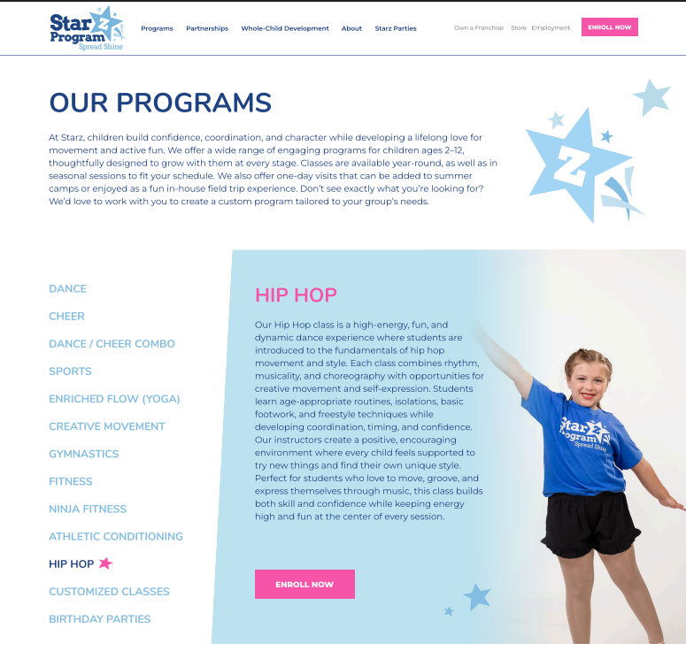
Used thoughtfully and built accessibly, tabs, accordions and sub-navigation can make detailed content feel lighter and easier to navigate.
The result is not necessarily less information.
It is less information demanding attention at once.
REMOVE THE INSIDE-OUT MESSAGE
For Jeff Sugarman, President & Creative Director at Ora | Brand Strategy + Design, one of the biggest problems is not how much a website says.
It is where the message begins.
Businesses often describe themselves from the inside out. They lead with processes, features, methodologies and internal terminology because those are the things occupying their days.
The customer’s perspective quietly slips out through a side door.
Jeff sees this frequently with startups, although established companies are hardly immune. Being deeply involved in building and operating a business can make it difficult to remember that visitors do not share the same context, vocabulary or fascination with the machinery behind the product.
He recently encountered a paragraph that packed in student-level data, advanced analytics, local expertise, credit for prior learning, a “holistic, 360-degree view,” equity-minded methods, program capacity and cost reduction.
The clearest benefit finally appeared near the end:
…the right help reaches the right student at the right moment.
There it was. Clear, human and useful, buried beneath a small landslide of explanation.
As Jeff asked:
Who has time to read all of that?
His advice returns to two truisms he keeps coming back to:
- KIS – Keep It Simple
- What’s in it for me?
Features matter. Processes matter. Technical details may matter enormously to someone comparing options.
But they should support the benefit, not make visitors mine for it.
A website does not become more credible by making a simple idea harder to understand.
REMOVE THE BELLS AND WHISTLES WITHOUT A JOB
Brad Haima, Founder & Creative Director at Circle Graphics, has been helping businesses communicate through branding, graphic design and website design since 1994.
Bold design, movement and unexpected elements can give a website energy and personality. But every element should have a reason for showing up.
As Brad puts it:
Every element on a website should earn its place. If it doesn’t help people understand the brand, find information or take the next step, it is decoration at best and friction at worst. Good design is not about showing everything a website can do. It is about making the right things impossible to miss.
That is the real test for animation, video, sliders, interactive effects and the shiny new feature everyone saw on another website last Tuesday.
Not:
Can we add it?
But:
What useful job will it perform?
If the answer is vague, the feature may be serving the designer, business owner or technology more than the visitor.
A website is not a digital showroom for available tricks.
It is a working tool.
REMOVE THE COMPULSION TO SAY EVERYTHING
Content develops the same barnacles.
Every department wants its audience mentioned. Every service needs equal billing. Every differentiator demands a paragraph. Every stakeholder has one more sentence to add so nobody could possibly misunderstand anything.
The result is often a homepage attempting to explain the entire organization before the visitor has decided whether to stay.
Five services compete for attention. Three audiences are squeezed into one headline. Paragraphs keep arriving in ceremonial formation.
The problem is not always that the information is unnecessary. It is that the website has failed to decide what matters first.
A strong website does not say everything immediately. It creates a sequence.
It gives visitors enough information to understand where they are, why it matters and where they should go next. Supporting detail remains available when they need it.
This is why subtraction requires strategy. Cutting words randomly can leave a website thin, vague or incomplete. Cutting the right words gives the message oxygen.
A website is not a storage locker. You do not improve it by finding room for one more box.
BEFORE YOU ADD, ASK WHAT YOU CAN REMOVE
More content can be valuable. More functionality can solve real problems. More visual interest can make a website memorable.
But “more” should be a decision, not the default setting.
Before adding another section, feature or flourish, ask:
- Does it help visitors understand something important?
- Does it make information easier to find or use?
- Does it support a meaningful business goal?
- Would anyone miss it if it disappeared?
That last question can be surprisingly productive.
Long before websites existed, French writer and aviator Antoine de Saint-Exupéry captured the principle in Wind, Sand and Stars:
It seems that perfection is attained, not when there is nothing more to add, but when there is nothing more to take away.
A website does not need to be perfect. But the principle holds.
Strategic growth opens doors.
Accidental growth blocks the hallway.
The best website may not be the one doing the most. It may be the one that knows exactly what it is there to do, and has the confidence to clear everything else out of the way.

Need sharper words and a clearer message? Let’s chat.



de Saint-Exupéry’s quote is amazing. He captures the essence of so many things in life, not just design.
One of my favourites as well, Grace! I love how it reframes perfection as an act of restraint and subtraction rather than accumulation. Sometimes less is more!
Teams need to spend more time listing everything, deciding what to add and remove, and then prioritizing.
Most people rush or even skip this process.
Over time things pile up like a garage. A dedicated person or team needs to do an annual audit. Otherwise, you leave the heavy lifting to the visitor, and they’ll simply disappear and go to the competition.