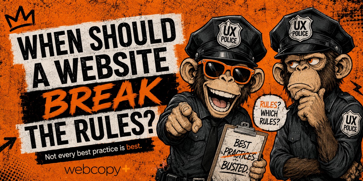
Websites come with no shortage of rules.
Put the CTA above the fold.
Be consistent.
Keep it simple.
Minimize friction.
Follow conventions.
Most of those rules exist for good reasons.
The trouble starts when “best practice” quietly turns into “must.”
I’ve been following Nielsen Norman Group since I started focusing specifically on web content back in 2006. Their site wasn’t exactly winning beauty contests then, and it still isn’t now.
That’s partly the point.
NN/G has never needed to look like a design agency. Its job is to make research, guidance and information easy to find and use. The site serves the purpose.
Even NN/G describes its famous usability heuristics as broad rules of thumb, not rigid prescriptions.
Which raises a better question than “What’s the best practice?”
What problem is the best practice supposed to solve, and does it actually solve that problem here?
I asked three experienced website professionals which rules they deliberately break.
Their answers were very different.
That’s what made them interesting.
CONSISTENCY CAN BECOME SAMENESS
Consistency is one of the foundations of good UX.
Familiar patterns reduce cognitive load and help people understand how an interface works.
Fair enough.
But Andy Patrick, Director of Experience Design at Jan Kelley, thinks consistency can go too far.
“If I was forced to pick one best practice, I’d probably say ‘consistency’ is what I ignore most often.”
His argument is that the web has changed.
People are more experienced online. AI and template-based platforms are also making it easier than ever to produce perfectly competent websites.
And perfectly competent can start looking awfully familiar.
“The web is being filled with more and more ‘good enough’ experiences created by AI or template service providers, so creating something unique is the only way to stand out.”
There’s an important distinction here.
Consistency helps people understand an experience. Sameness can make them forget it.
That doesn’t mean moving the navigation around just to keep visitors alert.
It means knowing which conventions make a website easier to use, and which ones are simply making every brand look like it came out of the same box.
Especially for premium brands, personality and surprise can have value too.
The trick is knowing where to spend them.
Break the pattern where it adds personality. Keep the pattern where breaking it adds confusion.
THE CTA DOESN’T ALWAYS BELONG FIRST
“Put the CTA above the fold” has become one of those pieces of website advice repeated so often it sounds universal.
It isn’t.
For simple, low-risk decisions, a prominent CTA makes perfect sense.
But Eric Bernal of Blast Digital Media sees a different pattern with higher-consideration purchases.
“For content-heavy or high-trust purchases like legal services, home renovations and healthcare, we deliberately push the primary CTA below an educational block first.”
His example nails it:
“For a $15K kitchen reno, nobody converts off a hero button. They convert after feeling understood.”
Exactly.
A visitor shopping for a T-shirt and a visitor choosing a lawyer are not making the same decision.
One might need a price and a button.
The other may need to understand the problem, see evidence of expertise, reduce perceived risk and decide whether they trust the people involved.
Then the button matters.
So perhaps the rule shouldn’t be:
Put the CTA above the fold.
Maybe it should be:
Put the CTA where the visitor is ready for it.
Sometimes the shortest route to the button is not the shortest route to trust.
MORE ISN’T MORE
Then there’s the opposite problem.
Someone spots a little empty space.
Dangerous.
Suddenly the website needs another feature, another paragraph, another animation, another testimonial, another CTA and perhaps something that spins.
Brad Haima, Creative Director at Circle Graphics, has a simpler approach.
“One best practice I’m happy to challenge is the tendency to keep adding more content, more features and more visual elements because they’re available.”
His point:
“More doesn’t automatically make a website better.”
This is where internal politics often collide with UX.
The sales team wants something.
Marketing wants something.
The CEO wants something.
Someone saw a competitor using a carousel.
Someone else discovered parallax scrolling.
Before long, the homepage has become a storage locker.
Brad’s test is better:
“Good design isn’t about showing everything you can do. It’s about making the right things easy to understand and use.”
Every addition has a cost.
It asks the visitor to notice something, process something or decide something.
So instead of asking:
Can we add this?
Try:
What gets harder if we do?
THE INTERESTING PART: THESE PEOPLE DISAGREE
At first glance, these three perspectives don’t line up neatly.
Andy is arguing that too much consistency can make a website forgettable.
Eric is arguing that more information can sometimes improve conversion.
Brad is arguing that adding more can make the experience worse.
So which one is right?
All three.
Because none of them is optimizing for the rule.
They’re optimizing for the situation.
A premium fashion brand may benefit from visual surprise.
A government benefits portal probably shouldn’t surprise anyone.
A $20 impulse purchase may need almost no explanation.
A $20,000 service probably does.
A simple professional-services site might get substantially better by removing half the stuff on it.
A complex healthcare site may genuinely need more depth.
Context changes the correct answer.
That’s the part most “best practice” lists leave out.
BEFORE YOU BREAK A RULE, ASK THREE QUESTIONS
This is where rule-breaking either becomes good judgment or self-indulgence.
Before ignoring a website best practice, ask:
1. What problem is this rule supposed to prevent?
Consistency reduces confusion.
Minimalism reduces unnecessary cognitive load.
Prominent CTAs help people act.
Know the reason before you throw out the rule.
2. Does that problem actually exist here?
Don’t solve a theoretical UX problem while creating a real one.
Your users, offer, market and buying decision matter more than somebody else’s checklist.
3. How will we know the exception worked?
Look at the evidence.
Analytics.
Conversions.
Search behaviour.
User testing.
Customer interviews.
Actual behaviour beats designer intuition, stakeholder preference and whatever somebody posted on LinkedIn yesterday.
Break rules with evidence, not ego.
KNOW WHY THE RULE EXISTS
Best practices are useful.
They stop us from reinventing the web every Tuesday.
They give us sensible defaults.
But defaults aren’t decisions.
The experienced designer knows the convention.
The better designer knows why it exists.
And the best one knows when the user is better served by breaking it.
Know the rule. Know the reason. Then decide whether it deserves to survive the page.
By Rick Sloboda, founder of Webcopy+ and website content strategist.
Is your website following best practices, or just following the crowd?
Let’s make sure the rules are actually helping.



Good points. Very rarely do you want to break Keep It Simple.
Thanks, and agreed, Darren! 🙌
Rules are made to be broken. 😅
Agreed, Dale. 😏