Recent redesign catastrophes have begged the question — how can Web-based businesses that want their brands to evolve avoid harsh backlashes and possible brand suicide?
Most would say the answer is simple — do it right and you won’t have a backlash, or at least you won’t have one you can’t recover from.
But humans are creatures of comfort and often have knee-jerk responses when faced with change, even when it’s for our own good. We don’t want to wake up one day to see that the Facebook features we’ve grown to love have suddenly changed, leaving us to awkwardly maneuver around new structures and functions back to the comfort zone. Just look at the brief stints of Facebook redesign rage that often promise mass exodus, but never deliver.
Even though redesign backlash is common, recovery can be more difficult in some cases than others. The deciding factor seems to be whether or not the user’s interests were adequately considered during the planning stages, and respected during launch.
Here are some recent and notable redesign catastrophes, the aftermath, and what we can learn from others’ mistakes.
Gawker Media
In early February, 2011, Gawker Media — owner of popular sites Gawker, Gizmodo and LifeHacker, among others — launched a redesign of its entire network. Founder Nick Denton justified the changes as a response to the evolving online media landscape. The new design was intended to move away from the traditional blog format, to one that incorporated the convergence of blog, magazine and television.
What Went Wrong
While attempting to cater to the changing online media environment, Gawker seemed to lose sight of maintaining an enjoyable user experience. That is, they put their desires in front of the users’, which is a big no-no no matter what business you’re in. People reported major difficulties adjusting to the new format, claiming they could no longer find what they were looking for.
The Aftermath
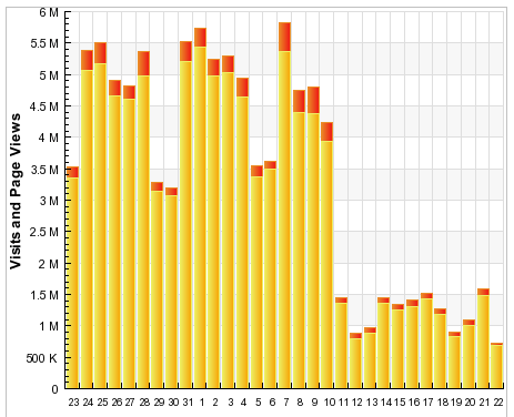
Even loyal users were so fed up with the confusing new navigation, they started leaving in droves, and are still lamenting over their bad experience. In a humourous post, Ian Lurie of Conversation Marketing claimed that Gawker had basically “designed themselves out of existence.” By Feb. 21, the adverse effects of the redesign were painfully obvious. Gizmodo, for example, saw a 60 to 70% drop in visitors since the launch.

(February Gizmodo stats from Sitemeter – traffic is still hovering around the 1M mark as of March 14)
Digg
In late August, 2010, Digg launched its new design, which was immediately met with overwhelming criticism by its users. Some said the navigation was ruined, others called the new Digg a Facebook clone. Most were pissed off that mainstream publishers were suddenly able to automatically post content on the site through RSS.
What Went Wrong
Frederic Lardinois of ReadWriteWeb said it best: “The launch of Digg’s redesign will likely go down in the history of social media as a textbook example for how to alienate your users.” Ouch. The new design and structure changed some of the unspoken rules of Digg, namely the understanding that one should not post their own content. Digg’s new version allowed for just that, drastically altering one of the fundamental appeals of using the site to find alternative, unbiased content.
The Aftermath
The redesign sparked a rebellion where angered users turned the new design against itself. By hijacking the new rule that allowed for other sites to post their own content, users banded together to upvote every Reddit story automatically posted thanks to new features. Eventually the entire front page of Digg was flooded with stories from the competitor’s site. By the end of September, traffic was down 26% among US users, while Reddit’s traffic increased 24%. Digg founder Kevin Rose responded to popular criticisms of the redesign on his blog, and promised to fix some of the bugs, while justifying other aspects of the redesign.
How to Soften the Backlash Blow
Knowing that redesigning a popular service, site or brand is most certainly going to meet some type of backlash, there are things you can do to prepare that will help soften the blow. Aside from being reincarnated as Zuckerberg or Jobs (who can pretty much do as they please without consequence), you can do your best to research, plan and even time your redesign for better reception.

Think of Users First
Ask yourself, are you redesigning the site based on the direction you believe your brand is heading? If so, you may encounter issues, as seen in the Gawker example. If your website’s main purpose is to deliver content to readers, then your redesign should focus on delivering it in the most intuitive way possible. Otherwise, your quality content, and its writers, will suffer.
As copywriters, we at Webcopyplus live by this mantra: write for your intended audience, not for your own interests, and they will reward you. After all, people aren’t coming to the site to see how good you are at writing; they’re coming to get the information that applies to them, fast.
The same principle applies to a website’s design. Don’t use a redesign as an opportunity to show off the fact that you have your finger on the pulse of online media (as Gawker tried to do), but do it for the purpose of improving the user experience and making it easier for them to consume your content.
In 2005, on A List Apart, Cameron Moll touched on the benefits of ‘realigning’ rather than redesigning, a concept that’s as true today as it was then. Redesigners, he argued, are often creative types with an inherent desire to refresh and renew a design simply because the old design seems stale. Realigners “cite strategic objectives and user needs as a reason to consider a site overhaul.” The latter approach, Moll believes, is more likely to be met with acceptance than shock.
Remember Where You Came From
In the case of Digg, we can see that fundamentally changing the core of your service can make your users awfully angry. One of Digg’s major appeals was that it rewarded stories people were genuinely interested in by posting them on the front page. The new design compromised the holy front page in favour of self-serving interests, which was great for those interests, but not for the lifeblood of Digg: its dedicated users. In their eyes, the redesign was the equivalent of an artist selling out to get played on the radio, while departing from what made them appealing to their fans in the first place. This, to them, equated to an ultimate betrayal, causing them to react with malice. And, unfortunately, the social nature of the site magnified their ability to retaliate.
How can you avoid this? When planning your redesign, it’s okay to make changes to fix what’s not working, but don’t abandon what does. Discovering what you should keep is as easy as looking at your metrics, or even asking your users what they like and don’t like.
Do It Nice and Slow
One way to muffle backlash is by making design tweaks in stages, rather than springing a full makeover on your users overnight. Facebook is known for redesigning certain features one by one, which appears to work well. Users might react negatively at first, but they’ll be less likely to throw their hands up in frustration and leave altogether. And if you’ve steered the design in the wrong direction, you can respond to feedback in stages, rather than having a monstrous list of complaints to address.
When All Else Fails
Mashable featured an interesting post on dealing with negative brand sentiment. Its author Maria Ogneva, Head of Community at Yammer, described negative online backlashers as ‘badvocates’, and also offered tips on how to best address their complaints, including:
1.) Figure out the issue – what was their motivation?
2.) Reach out – acknowledge their complaint.
3.) Don’t let it stew – address conflict quickly.
4.) Never make it personal – even if they make it personal.
5.) Take action, close the loop – communicate to them the resolution.
6.) Never lose your cool – choose your words wisely.
The Bottom Line
Change is inevitable, but maintaining a desirable user experience should be your number one priority.


Leave a Reply