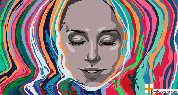
A content marketer, web designer and web copywriter walk into a bar; after a few rounds of shop talk, the designer asks the other two to guess the most popular colour for websites. If “blue” is your response, you’re right. A recent Wired piece cites a study identifying shades of blue as the most used colour on the Web’s 10 most popular websites.
How and how much does the psychology of colour affect consumer behaviour, and why?
People take just 90 seconds to make up their minds about a person or product, and base anywhere from 62% to 90% of that decision on colour alone — key findings from “Impact of Colour on Marketing,” a heavily quoted, peer-reviewed research article.
Brand recognition and consumer confidence increases by 80% when brands use colours that consumers consider appropriate to the brand persona or to its products, per a KISSmetrics report cited in Business Insider.
Best practice also clearly establishes that colour is a key component in both defining competitive advantage, and influencing consumer emotion, behaviour and decisions — the main foci of colour theory in design for branding and marketing. (There are many comprehensive primers on how colour theory applies specifically to web design and content production, and we like this one from Smashing Magazine.)
So, why ask the why, when we already have a functional knowledge of “how” and “how much”?
The Hook
It isn’t enough to conclude “blue = reliability,” then simply inject some blue into your brand refresh or marketing campaign. An oversimplification perhaps, but not by much; we’ve all seen projects where key stakeholders take a “paint by numbers” approach to colour theory, or make highly subjective colour decisions (“blue is boring”) regardless of what the market research suggests.
A common thread through Branding Magazine’s list of brand trends for 2017: Brands increasingly need to differentiate themselves, and to connect responsively, meaningfully and specifically with existing and potential audiences. Nobody can afford to ignore the potential immediate and long term impact of using colour, and colour psychology, to achieve effective results.
Colour psychology gets into the “why” of colour theory, studying the biochemistry of how colour combinations and variations affect human behaviour, and providing a rationale for using colour in specific ways.
The goal of colour psychology is more accurate, impactful design and content.
The Bottom Line
To understand how to use colour, we need to understand how colour behaves.
Scientifically speaking, colour is light. Light is a wave that humans process on a biological, electrochemical level. As colour waves pass through the retina, they are converted into electrical impulses that pass to the hypothalamus, the part of the brain governing the hormonal and endocrine system. Basically: Light, and therefore colour, affects our minds and bodies. We can measure the effect of colour scientifically, and can use the results to influence mood and behaviour.
A case in point is the use of light therapy to treat Seasonal Affective Disorder (SAD), a well-documented, dramatic example of what Webcopy+ partner and colour psychology specialist Harold Finkleman refers to as the “universal, psychophysical reaction” we all have to light.
Finkleman points out the nature of colour is almost uniquely complex. It can affect us psychologically or emotionally through preprogrammed social semiotics or memories; or as metabolic triggers, colours can affect us psychologically and physically as specific frequencies have various kinds of electrochemical impact on us neurologically (he noted that 70% of the sensors gathering external information for the brain are on the frequency-sensitive retinal components of the eyes). Similarly, the various colour frequencies have electrobiochemical impact on both our surface and subdermal cells in ways that fill volumes.
Plus, there are other influences. “This complexity means that a single colour can affect an individual many different ways, even in conflicting ways,” explained Finkleman. The same goes for influence on groups. The study and understanding of human response to colour is influenced by so many factors that it can be, in the hands of those enthusiasts willing to put in the time, one of the most versatile and sometimes precise tools in the designer’s tool box.
Check this Quicksprout infographic for some quick stats and FAQ, or this Entrepreneur article for some ways these variations apply to using colour for branding and conversion.
A Psychology Today article raises other issues, such as colour blindness and synesthesia, and touches on socio-cultural differences in how people conceptualize colour (e.g. some cultures have more “colour words” than others).
That’s a lot to process, so we’ll share two considerations we think are key to impactful colour use:
There is no universal “right” or “wrong” colour, or universal single “meaning” for any one colour. There are only context-specific responses to combinations of colours that collectively trigger an emotion or behaviour. For example, in practice it’s true that the colour blue is statistically favoured by both men and women, and is used on the websites of many organizations wanting to project reliability and instill trust. However, the colour blue is sparingly used on websites related to food, or not at all — because blue is considered an appetite suppressant, often credited to the fact there are very few edible items in nature that are coloured blue.
Humans perceive and react to a colour in the context of other colours around it. No colour works in isolation. Use colour combinations and variations following colour theory best practice, refined through A/B testing, to trigger the desired response. For example, switching a “Buy Now” button colour from green to red (while retaining all other content elements on the page) may statistically increase the conversion rate, but it’s trickier to determine whether this is mainly due to the colour red — or because previously, the green button simply didn’t stand out enough from the other design and colour elements.
The Crystal Ball
Colour palette choices are limited by pre-existing branding guidelines or other constraints, so designers must continue to rely on other methods — such as using contrasting hues, tints, tones or shades, and on working with other content elements and providers — to achieve similar results.
Colour psychology may be more directly applicable to branding than conversion, where there can be far more immediate variables.
And, the theory and application of colour psychology continues to be controversial, though marketers have been using colour theory for decades and will continue to use anything that could provide a competitive edge.
Our take-home: Colour can have highly targeted impact, but only when used with complementary design elements and content that respects our complex relationship to colour.

How do you make decisions to maximize the impact of colour in design and content marketing? How much of a role do you think colour psychology should play?
From a web copywriter’s and content strategist’s perspectives, the goal is to create copy that seamlessly optimizes the impact of the brand to help achieve the desired emotional response. Ask us today how we would enhance the impact of your next project.

Such a complex topic! It would be nice to have a color cheat sheet, but with so many factors and variables, it seems it can’t be dummied down effectively.