
Did you forego your venti half-sweet hazelnut soy latte habit to experiment with a pay-per-click ad campaign this month? We’re offering some tips to help you get started, so you can sleep tight knowing you didn’t renounce your coffee princess throne for nothing.
The Facebook Ad
Buying Facebook ads is a great way to reach the 90% of the population that are wasting 85% of their work day checking out Becky from high school’s baby bump photos (exact percentages TBD).
Some great features of Facebook ads: You can pick whom your ads are targeting, specify the amount you’re willing to pay per click, and monitor your campaign’s effectiveness with the insights function.
Here are some general guidelines to help you get started:
Facebook ads only allow 25 characters per headline and 135 for content, so think carefully about both the image and copy. As the copy is limited, a strong image is ideal to help illustrate the benefits of your product or service. Make sure it’s recognizable. If you’re a relatively new company with lower brand recognition, it’s probably best to go with an image other than your logo.
In terms of the text, think of your Facebook ad as a quick call to action. There’s not enough room to capture everything that’s great about what you’re selling, but you can certainly pique interest and encourage a click-through for more information. Keep it concise, persuasive and benefit-centric. Try highlighting your unique selling proposition and make it snappy.
Ensure your messaging is consistent wherever the visitor lands after clicking, whether it’s your Facebook page or a landing page on your website. For example, if you’re promoting a particular deal you’re offering, make sure the click-through leads to a page that includes more information about said deal. Otherwise, the clicker will become confused and your chances of losing them will increase.
You may want to consider using your ad to promote a special Facebook-only discount, which will also allow you to measure the effectiveness of your campaign. Facebook suggests making any special offers easy to find on the corresponding landing page.
Optimize your ad for your desired audience. While developing your Facebook ad, you’re given the opportunity to highlight keywords that you believe your target audience will list in their interests. These words don’t necessarily have to be included in your content, but they help Facebook direct your ad to the appropriate eyeballs. For example, if you’re advertising your web design services, you might want to target people who list “web marketing” in their interests.
Bad
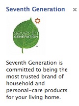
Whoever wrote this Seventh Generation Facebook ad should probably just spray some of their cleaning products on their marketing budget and use it to wipe down the bathroom. Do you care whether they’re “committed to being the most trusted brand of household and personal-care products for your living home”? Are you remotely compelled to click? Personally, I’m trying to wrap my head around my home having a pulse. They should have at least highlighted their main selling point – that their products are environmentally friendly.
Good
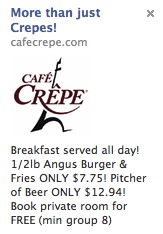
Whoever wrote this ad for Café Crepe deserves a free pitcher of beer. Although the business is called “Café Crepe,” the ad copy tells us they serve more than just crepes. On top of that, they’re offering a great deal on a burger and fries, and a pitcher of beer. Plus, they used the magic word “FREE.”
Google AdWords
Google ads are great since they’re not limited to one social network. Although the headline also has a 25-character limit, the Google ad differs from the Facebook ad in several ways.
- No images or colour allowed
- 35 characters per text row (four rows allowed in total, including your URL and headline)
- You can optimize it with keywords
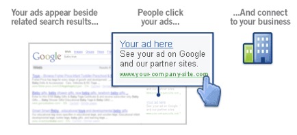
Since there is no visual aid, the words in your Google ad are even more important for delivering your brand message. As with Facebook ads, ensure your Google ad content conveys your product or service’s most attractive benefits, and that it relates to the content on your landing page.
You can use the Google Keyword Tool to find appropriate keywords to use in your ad, and as with other web copywriting, ensure that the placement of keywords for search engine optimization doesn’t compromise the logic of your content. Remember – you’re writing for both search engines AND people, who will ideally click through your ad and interact with your brand.
The fact that you can include your URL, and that it can be modified to whatever you wish, as long as the domain remains the same, is another opportunity to use text wisely in your Google ad. For example, if Webcopyplus ran an ad that promoted our white paper writing services, we might make the URL www.webcopyplus.com/WhitePapers.
What a Google Ad Looks Like
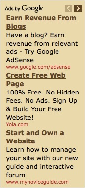
These ads are all customer and benefit-centric, although the last one is a bit yawn-worthy.
As with other PPC ads, you can run different ads and switch up certain elements to see which works better. Try different headlines, promotional offers, calls to action and display URLs, let them run for a while, and use the click-through data to determine which works best for future use. You might be surprised at what switching one word here and there will do for your click-through rates. Of course, starting with a solid foundation can help you save money in your testing.
The Landing Page
The landing page is an equally important component of your campaign. A great one helps you reduce your PPC costs by boosting conversions. For example, someone clicks on your ad, which leads them to the landing page that, if well done, will get the clicker to do what you want them to do — sign up for your newsletter, submit their email address for lead follow up, complete a transaction, or what have you.
Landing page content is easy to test for effectiveness. Using methods such as A/B testing (running two different landing pages at once) allows you to try different copy and see what works best.
More points for writing a great landing page that makes click-throughs worthwhile:
- Ensure the copy relates to the corresponding ad in tone and content
- Deliver the important information up front, preferably before the fold (where the visitor must start scrolling down)
- Make the call to action strong and straightforward, with a boldly designed button or form, so there’s no mistake about what you want the visitor to do
- Keep it simple and focused on getting the visitor to complete the desired task
- Keep links to a minimum, since these are distractions from your goal
- Keep the copy customer-centric – don’t talk about your company, but what it can do for ‘you’ (your prospect)
Bad
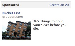
Leads to…
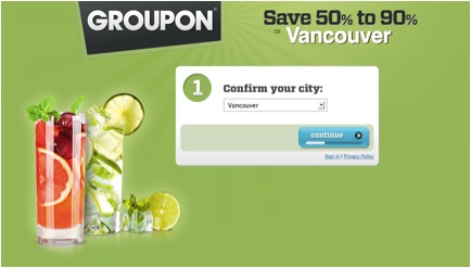
… which then leads you to confirm your city (hasn’t this already been established as Vancouver?), then enter your email address to see today’s deal. There is no mention of how doing these things will help you cross things off your bucket list (and what is up with that image in the Facebook ad?!) Not to mention, if you know anything about Groupon, the deals certainly don’t often have much to do with life-changing activities or events. I don’t know about you, but my bucket list doesn’t include getting 50% off my next bikini wax (p.s. there are some things you should never buy at discounted rates.)
Good
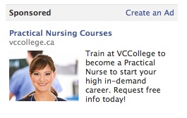
Leads to…
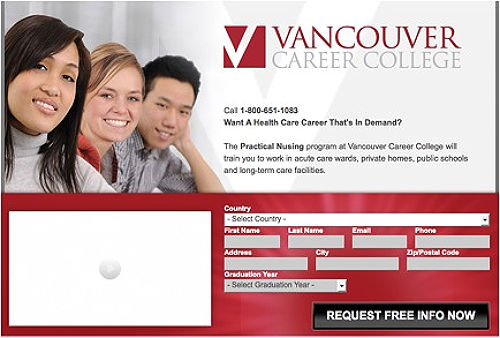
The Facebook ad copy directly relates to the landing page content, which gets to the point quickly, before you need to scroll down. You’re given two easy contact options – a phone number or a form to get more information. You’re told exactly what the program is and how it will train you. And there’s that magic word “FREE” again. Nice!
For more on how design and copy can work together for a killer landing page, check out Formstack’s tips. Need help with your PPC ad or Landing page copy? Check out How to Find the Right Tone for Your Web Copy.


Leave a Reply