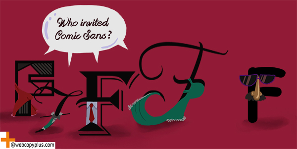
You wouldn’t use Comic Sans if you expect to be taken seriously, and you heard somewhere Arial is supposed to be a “safe” choice…for some reason. Knowing how to use typography for business advantage, is partly why web designers, graphic designers and web copywriters have jobs. What is typography and why is it so important?
Typography, put simply, is how words look in digital or printed media: How words are placed and arranged in relation to the rest of the text and any other content elements, such as the user interface, colour, images or video.
Choice and placement of text isn’t just to create a nice-looking, usable, readable style. The different typographical elements — including typeface, font, leading, kerning — all work together to help produce effective content marketing.
From Boston-based Graphic Designer Kjell Reigstad: “Typography is all about organizing shapes. Letters are shapes. Words are collections of shapes. Paragraphs are larger collections of shapes, and so on. “Good” typography organizes those shapes in such a way that they do what they’re intended to do — communicate language — with the least amount of interference. “Great” typography goes one step further, evoking a feeling to enhance the meaning of the text.
Good typography creates a typographical identity, working on both a conscious and subconscious level to strengthen the brand, user experience and messaging. Bad typography calls attention to itself — reflecting badly on the brand, providing a poor user experience, and reducing the impact of a message or call to action.
The Hook
How much of an advantage can typography give you?
Let’s look at just one typographical element: Typeface, referring to a group of characters, letters and numbers that share the same design.
A frequently-quoted 2012 survey by filmmaker Errol Morris of approximately 45,000 New York Times readers, found that choice of typeface affects how viewers feel about content.
In the survey, the same text passage was presented to viewers in six different typefaces, both serif and sans-serif, in a similar regular font size. The respondents were then asked questions such as “How much do you agree/disagree” with what they had read. Factoring in the possibility the results are the result of random chance, the winning font emerged as being 1.5% more believable than the rest: “That advantage [1.5%] may seems small, but if that was a bump up in sales figures, many online companies would kill for it. The fact that font matters at all is a wonderment.” In this case, what the winner was (Baskerville) is less immediately interesting, than the fact typeface choice alone can significantly affect viewer perception.
As Davide Casali, Product Design Lead on WordPress.com, puts it: “Typography communicates twice…through the shape and balance of the various elements [and] through the actual content it conveys.” What does that mean for a content marketer?
People associate the way a word looks — in other words, it’s visual context — with what they think it says, and what they feel about it. Typographical elements directly influence how consumers think and feel.
The Bottom Line
Typography can help you do three main things:
- Represent the brand, with a style that fits with and reinforces the brand voice and identity.
- Communicate the message, including ensuring words are quickly or easily read and understood.
- Provide visual appeal, retaining viewer interest and inspiring action.
Loaded question: How does typography achieve an effective level of representation, communication and appeal?
Of course, Robert Bringhurst’s primer “The Elements of Typographic Style” is still widely respected as a classic, foundational reference to the tools and vocabulary of graphic design.
An interesting open source, Creative Commons project maintained and curated by Richard Rutter, Clearleft Co-Founder and “Web Typography Evangelist,” transposes the Bringhurst principles into HTML and CSS.
That’s a lot to process, so this Crazy Egg piece on design elements to consider for print and Web design is a quick, digestible read.
More specific thoughts from some of our Webcopy+ design associates:
Francesco Bertelli, Design Director at Work & Co, Brooklyn, on eyeballing and context:
- You can’t design a typeface, or lay out a paragraph, just [by] applying geometry rules. It will likely produce a bland result. It is when you start balancing those geometric shapes with your eyeball, that you will be able to have perfect kerning and hinting…[this] is a manual process that still needs to be learned by experience and by trying different combinations.
- Use typeface from well-known foundries. They did the heavy lifting for you — just use the typeface they meticulously designed over the years. It doesn’t matter if a font is “new,” or designed 50 years ago.
- Learn the history of the typeface you love before using it. A typeface is designed for a specific purpose, not just for art’s sake, so be careful to maintain the same purpose. For example, the next time you want to use an Archer font for a dentist’s business card because it’s cool, just [consider] it was originally designed for Martha Stewart Living magazine, and ask yourself if it belongs to the same “territory.”
Alana Waters-Piper, Global Creative Director at Claire’s, on playing with hierarchy and “less is more”:
- Once you understand the concepts of communication hierarchy, how fonts play off each other, and the personality of your client’s brand, effective typography is much easier to execute. Say you have a five-word headline. Distill it down to the one or two words that are most essential to the message. Those should get the most love with font weight, style…let lower hierarchy words play a supporting role in a complimentary font. Don’t be trapped by neat alignment. Play with varying justification and placement. Let the words hug each other. The final result should feel locked up.
- Resist the urge to layer on multiple elaborate fonts. It can go gaudy real fast! If you find yourself second-guessing using the classics, spend a little time with a Massimo Vignelli article. The guy made an epic career sticking to five basic fonts, but if you study his layouts, he leaned on communication hierarchy, varying weight and creative placement to make those basic typefaces work.
More from Davide Casali, WordPress.com Product Design Lead, on branding and structure:
- Typography as branding. The choice and structure of the typeface, the way it’s set, the balance on the page, is of incredible importance to reaffirm and communicate with the reader. It might be seen as a subtlety, but in my opinion a distinctive type set that reinforces the brand can be so strong [that] it won’t need anything else.
- Typography as structure. Typography isn’t just the typeface, is the way the whole page is set as well as how every written element on the page works together. Taking care of size, line height, spacing and so on is a huge deal, and unfortunately these small tweaks that can have a huge impact are overlooked by letting the defaults stay unchanged.
A final thought from graphic designer Kjell Reigstad: ”You can do amazing things with a seemingly boring typeface, and you can do horrible things with an exciting typeface. Successful typography comes from using the font well, not just choosing the font well.”
The Crystal Ball
Typography seems to influence what we think and feel, but how? A recent Wired piece explores the implications of Errol Morris’ infamous survey, pointing out there’s no scientific evidence for the “truthiness” of Baskerville — or why Comic Sans is associated with less serious content.
There’s currently nothing empirical to tell us why a font makes people feel a certain way, but the research may be catching up. The same article cites preliminary studies in Britain to measure typography’s emotional impact, obtaining more objective, finer-grain data on how our brain’s process typography using FMRI machines that map how the brain reacts to certain fonts.
Cracking that mystery would take the application of typography in content marketing and advertising to another level: “Just imagine a typeface that could inspire empathy inherently, based on the softness of a letter’s apex or by increasing or decreasing negative space in characters. It’s not possible yet—typographers will continue to design letterforms based on intuition, taste and clarity — but it’s certainly a wild idea.”
That said, there’s no implication of anything significantly lacking in the way designers have been designing with typography; it’s simply far less predictable in terms of results. Webcopy+ associate, Ashleigh Axios, Design Exponent, Automattic: “I love those rare instances where typography transcends and becomes form, message and vehicle all on its own. It’s rare, but there are times when a few simple characters created, positioned, paired and placed with intent become iconic. There’s no recipe for making it happen; it’s as much circumstance as it is training and a good eye for design.”

Do you think that there’s “no recipe”? What’s your approach typography? Start that conversation here — and contact us. One of our seasoned web copywriters would love to work with you to support your design, and help maximize your content marketing results.


People always see typography but they don’t notice it. Yet, like this great article points out, it impacts people in many ways.
Great point! Typography shapes communication.
“Typography shapes communication” Is that pun intended?? :P