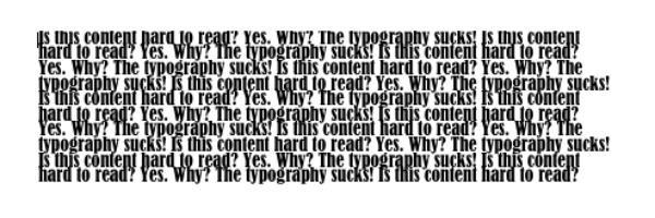
“Something looks funny with the web copy…it looks really bad.” That was a part of the message we recently received form a client who was reviewing a design mock-up for his soon-to-be-launched website. “We really like the copy,” they had said just a few days earlier. So they liked what it stated, just not how it looked. The culprit: typography.
Typography is an important design element. It can aid readability and usability, and help convey the right message. In fact, experienced designers use typography to portray a certain purpose, impression and brand, skillfully blending fonts with designs.
Good Typography Example
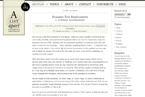
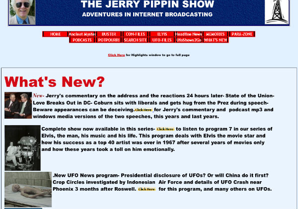
Poor Typography Example
Kerning, Tracking, Leading, etc.
But what if you don’t know about kerning, line height, tracking, leading, and other advanced design elements? Well, you could seek insight from some informative articles:
- 5 Simple Steps to Better Typography
- 20 Do’s and Don’ts of Effective Web Typography
- 50 Useful Design Tools For Beautiful Web Typography
- The Typographic Scale
Or, you could just leave it to the pros, and hire a well-versed designer who will get your typography right, and make your website pleasing to look at and easy to read.


Leave a Reply